
Jewellery trends 2027: styles to explore and how to wear them
Explore seven jewellery styling directions for 2027, from pendants and textures to colour, with ideas for clothes you already wear.
Which jewellery could you choose for 2027 without buying an entirely new collection? Fashion presentations offer ideas, but a trend becomes useful when it works with your own clothes. Visible pendants, texture, a touch of colour or pearl-like details can refresh an outfit with a single piece. The best starting point remains your wardrobe, preferred proportions and the jewellery you already enjoy wearing, rather than an expectation that everything familiar must be replaced for the next season.
Prepared in November 2026, this guide draws on collections already presented and an editorial reading of styles worth exploring. It is not a ranking of 2027 sales or a certainty about future preferences. The suggestions help you choose, try and compare. Saze Diffusion examples illustrate shapes in the catalogue; they do not imply a partnership with the fashion houses mentioned or an equivalence of materials, construction, manufacturing methods or commercial positioning between those houses and the catalogue references.
Read trends as ideas rather than obligations
Observe clearly identified collections
When seeking inspiration, look at dated collections instead of images gathered without context. The Chloé Spring 2027 collection is one example of an official presentation available when this guide was prepared. Consider the whole silhouette: clothes, necklines, fabrics and accessories. An isolated picture can draw attention to a detail, but cannot prove that a particular piece will dominate every shop, country or wardrobe. Keep the original context when interpreting what you see and choosing which idea to try.
Separate observation from personal interpretation
Dior jewellery in its 2026–2027 collections includes flowers, decorative pearls and coloured details. Such reference points can inspire an approach rather than an exact copy of an outfit. The seven directions below are styling suggestions, not an official list imposed by those houses. You can choose a texture, proportion or colour that suits your clothes while keeping your own combination. An inspiration reference should never become an unsupported claim about a different product's origin or materials.
Choose a change you can actually wear
Ask what you want to alter: add a bright detail to knitwear, make a shirt look more graphic or give a necklace the central role. A concrete answer helps identify a useful piece. If you change length, volume and every colour at once, it becomes harder to tell which part you like. Start with one readable change and try several outfits before considering another item, so the choice serves your normal wardrobe as well as a single attractive image.
Seven styling directions to explore for 2027
1. A pendant that structures a simple outfit
A visible pendant creates a focal point on an otherwise plain outfit. Try it with a top you wear frequently and choose a shape you can distinguish without looking extremely closely. Its length should leave the motif visible, on skin or fabric according to your preference. Check buttons and seams too: decoration resting directly against another strong detail can become difficult to read. Judge the result from a normal viewing distance instead of only through a close-up photograph.
You can keep earrings understated to let the pendant lead. This does not require removing every other piece; it simply gives the composition a clear emphasis. If the motif feels too prominent, try a different fabric contrast or another position within the stated adjustment range. Do not assume an extension offers unlimited freedom. The right change may be a small repositioning, rather than a longer chain or an additional necklace added to make the arrangement appear more elaborate.
2. Textured surfaces and defined volume
A twisted ring, ball-detail earrings or raised metal texture can enrich an outfit without introducing several colours. Observe how the surface catches light as you move, then compare it with a smooth piece already in your collection. That contrast may be enough to refresh the composition. You do not need the largest available design to make the texture readable. Shape, spacing and the surrounding fabric influence its presence as much as the size shown in a product title.
Consider contact as well. Texture that looks attractive in a photograph still needs to work with the clothes and movements you have planned. Try the piece with a representative sleeve, collar or scarf. This lets you select it for its design while considering how easily you can put it on, remove it and store it afterwards. A styling choice is more useful when it remains comfortable and practical through the day, rather than only during a brief mirror check.
3. White details and pearl-like appearances
A white accent can create a gentle transition between jewellery and a contrasting outfit. It may appear on studs, a drop pendant or a composite motif. The effect depends on shape, surface and background. Do not confuse appearance with composition: “pearl”, “pearlescent” and “mother-of-pearl effect” need to be read alongside the listing's material details. A decorative resemblance can support a styling idea without allowing you to describe two different components as though they were the same natural material.
For an accessible combination, try the accent with a garment that does not have an overwhelmingly dominant print. Then, if desired, add a ring or bracelet repeating only the metal colour. This creates continuity without requiring an exactly matching set. The result can remain personal even when the pieces were bought at different times and have different volumes. Look for a relationship between them that is visible to you, rather than requiring identical motifs across every item in the outfit.
4. One colour as a starting point
Coloured jewellery can repeat a shade in clothing or introduce an intentional contrast. Begin with one accent colour and observe it in the lighting in which you expect to wear the outfit. A shop photograph may show it differently from your own surroundings. Very similar shades do not always match as expected; a clear contrast can be easier to assess than an approximate match. Try both against the actual garment before deciding that a particular colour combination does or does not work.
You can keep the remaining accessories restrained and let the jewellery carry the colour. If you prefer several accents, leave visual space between them and assess the effect from the front and in movement. Our guide to choosing jewellery colours adds ideas about metal tones. Here the focus also includes decorative elements and their shades, rather than only the choice between gold-tone and silver-tone finishes. Keep those two aspects separate when describing the piece or comparing its specifications.
5. Motifs as personal details
A flower, heart, star or clover can make a selection feel personal without requiring a universal meaning. Choose it because you like its silhouette or associate it with a memory. The same drawing can be discreet on a fine chain and prominent on a ring. That change in scale often tells you more about the result than the motif's name alone. Look at how much space the shape occupies, where it sits and what remains visible around it.
Avoid gathering several symbols only because they belong to a theme. Consider their visual presence and placement. You might keep one principal motif and use simpler shapes around it. For a gift, explain your own intention without inventing a power, protection or historical tradition that has not been established for the piece. A personal connection is enough to make the choice thoughtful; it does not need to become a claim about the effect a symbol will have on its wearer.
6. Silver-tone jewellery as a graphic choice
A silver-tone finish stands out differently depending on fabric and lighting. Try it with a light shirt, dark top or coloured garment before deciding what effect you want. There is no requirement based on age or season. Someone accustomed to gold-tone pieces can explore another colour with a single reference instead of replacing everything they enjoy. Compare the piece with familiar clothes and accessories so you are judging a useful combination, rather than its appearance against an unrelated display background.
“Silver-tone” does not establish sterling silver. Read the principal material and finish separately in the catalogue. A styling composition can combine several metal colours if you like the result; a shared shape or rhythm can make your intention easier to read. Trying the pieces with real clothes is more informative than a universal rule about permitted colours. Keep the freedom of an aesthetic choice separate from the accuracy required when describing what a particular piece is actually made from.
7. Several lines with clearly visible spacing
Two distinct lines can add depth around a simple neckline. You can choose an assembled design or combine separate references, but what the purchase includes should remain clear. Look at lengths, motif sizes and clasp positions. The chains should not need constant pulling to maintain the effect first seen in the mirror. An existing layered piece and several independent necklaces may look related while behaving differently when put on, adjusted and stored after wearing.
Start with two levels and check what happens when you sit down and turn your head. If motifs overlap, change the selection rather than automatically adding more layers. This direction offers one way to explore proportions; it does not make layering compulsory. A pendant worn alone can produce an equally complete effect for the chosen outfit. Keep the arrangement readable and practical instead of using the number of chains as a measure of how current or elaborate it looks.
Turn a styling direction into a practical combination
| Chosen direction | Starting outfit | Piece to try | Useful check |
|---|---|---|---|
| Visible pendant | Plain top | A clear central shape | Position relative to the neckline |
| Texture | Simple shirt | Raised ring or earrings | Contact with fabric and accessories |
| White detail | Contrasting garment | Decorative drop or studs | Stated material of the decoration |
| Accent colour | Restrained palette | One coloured piece | Shade under real lighting |
| Personal motif | Everyday outfit | A deliberately chosen shape | Scale and placement |
| Graphic silver tone | Light or dark top | Silver-tone chain | Contrast with the garment |
| Several lines | Open neckline | Double-layer design | Spacing during movement |
Six Saze Diffusion examples for your selection
A drop pendant for exploring a light decorative accent
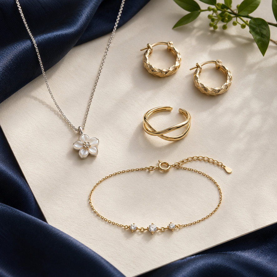
The pearlescent drop necklace 50980723 has a white pearlescent-looking detail on gold-tone stainless steel. Its chain measures 39 cm with a 5 cm extension. Try it as a central point on a plain top and check where the drop sits within the neckline. It illustrates the light-decoration idea without establishing natural mother-of-pearl or an official link to a runway trend. Compare the stated measurements with your preferred position rather than expecting the listing photograph to reproduce your own fit exactly.
A clover combining white and silver-tone contrast
The silver-tone white clover necklace 33537003 combines four white shapes with silver-tone outlines on stainless steel. Its listing gives 39 cm plus a 5 cm extension. A dark garment can help define the motif, while a lighter fabric creates gentler contrast. Try both possibilities with your clothes rather than choosing solely from the background in the product photograph. This also helps distinguish the finish you enjoy from assumptions about a precious metal or natural decorative material that the description does not establish.
An assembled necklace for exploring two layers
The heart and star necklace 52305252 brings together two gold-tone layers of 40 and 45 cm with a 5 cm extension. A small star drop adds asymmetry. It lets you explore several lines within one reference whose chains share a closure. Leave space around the design and check that a neckline, button or another pendant does not hide the details you want to show. Do not describe it as two independent necklaces when explaining its contents or planning a comparison.
A twisted ring for understated texture
The double twisted-wire ring 11324925-2 features two parallel lines in gold-tone stainless steel. Its relief provides visual presence without a large coloured decoration. The listing describes an adjustable design, not universal sizing: check whether its possibilities suit your requirements. Begin by wearing it alone, then compare it with familiar rings to see whether the shapes remain distinct and contact is reasonable. You can explore texture without making repeated changes to the opening or assuming an unlimited adjustment range.
Ball-detail hoops for a compact visible volume
The small gold-tone ball hoop earrings 10969603-12 measure 1.8 cm and are sold as a pair. Closely spaced spheres create a rhythm of reflections around the ear. They illustrate texture near the face without requiring very long earrings. Check the fastening, proportions and your personal comfort; size alone does not guarantee universal ease of wear or make the design suitable for sleeping. The example is about daytime styling and visible shape, rather than a recommendation for unrestricted use.
A rhinestone bracelet for a small sparkling accent
The fine three-rhinestone bracelet 10201217 is listed at 17 cm with a 5 cm extension. Its three sparkling details can complement a composition in which the necklace remains central. Compare the adjustment and spacing with a watch if you wear one. The rhinestones provide a decorative effect; their presence does not justify describing the piece as diamond-set or assigning it an unstated manufacturing process. Keep its visual role and documented material description clear when choosing or explaining the combination.
Make choices that remain useful after the season
Try three outfits before adding a piece
Before ordering, choose three real garments with which you want to wear the jewellery. Note the effect sought for each: a light accent, texture or several lines. Then compare the stated measurements with something you already own. This helps show whether the purchase serves several situations or only one isolated image. It also gives you the chance to rediscover an older piece simply by changing its combination, rather than assuming every new styling idea must start with a new purchase.
Plan storage and care
An enjoyable selection also considers where pieces will be kept. A double-layer necklace needs its chains to remain organised; a light decoration benefits from avoiding contact with harder surfaces. Read the stainless steel jewellery care advice and the instructions for the actual model. Choosing a style for 2027 does not remove the importance of those habits. A favourite combination is easier to repeat when each reference remains identifiable, untangled and ready to put on without hurried repairs or forced adjustments.
For retailers, test before expanding the assortment
A fashion direction can inspire a small selection without proving identical demand among your customers. Present a few coherent references, observe questions and compare them with actual sales. Avoid buying broadly only because something is labelled a trend. The Saze Diffusion catalogue helps compare available shapes; keep replenishment criteria linked to your own activity and descriptions accurate. A house mentioned as inspiration should not be presented as a partner, manufacturer or endorsement of the different references you sell.
Frequently asked questions about jewellery trends in 2027
Can we already know every trend for 2027?
No. A selection prepared in late 2026 uses collections already presented and editorial interpretation. It needs to remain open to revision. Distinguish visible styles, suggested combinations and predictions about future preferences. A useful article explains that context instead of turning a proposal into certainty about the whole coming year, every market or the sales a particular design might achieve.
Do I have to choose very large jewellery?
You can explore texture, colour or a pendant without choosing a large volume. The result depends on clothes, spacing and your preferences. Try one more prominent piece and assess the whole outfit in movement. There is no mandatory dimension for a composition to look current or thoughtfully put together, and a compact design can remain visually clear against an appropriate background.
Can I keep wearing minimalist pieces?
Yes. An understated piece can accompany a more expressive element or remain on its own. Your collection does not have to be replaced for a new season. First look for combinations that refresh familiar habits using jewellery you already have. A small change in texture, placement or colour can alter a familiar outfit without requiring a completely different style or a larger number of accessories.
Are pearls and pearlescent decorations equivalent?
No. A visual resemblance does not establish identical materials. Read the listing's details for each component and keep the stated terminology. “Pearlescent-looking” describes an effect without proving natural mother-of-pearl. A styling selection can connect similar visual effects, but a commercial description needs to preserve distinctions between the materials actually documented for each piece rather than replacing them with a more prestigious name.
How do I choose just one piece to begin with?
Start with an outfit you wear often and an effect you want to add. Check the reference's dimensions, adjustment and care, then imagine two further combinations. If the piece retains a clear role in those situations, it is a coherent possibility. The best first selection fits your habits without depending only on a trend ranking or an assumption that a new season requires an entirely new collection.
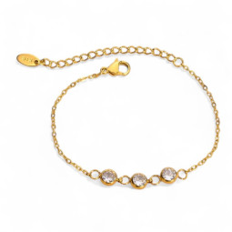
Gold Fine Three Rhinestone Bracelet 10201217
Fine gold-tone stainless steel chain bracelet with three bezel-set round rhinestones. Delicate and bright.
Price €5.04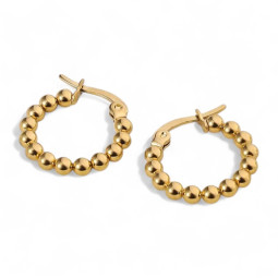
Gold Small Ball Hoop Earrings 10969603-12
Small gold-tone stainless steel hoops made of large, tightly packed beads. A mini size full of relief.
Price €3.00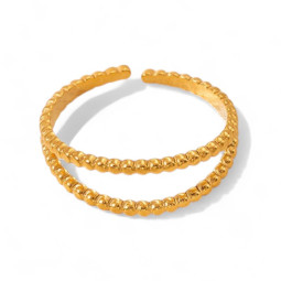
Gold Double Twisted Wire Ring 11324925-2
Slim open gold-tone stainless steel ring made of two parallel twisted bands, set slightly apart.
Price €2.52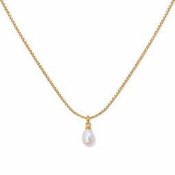
Gold-tone necklace with a pearlescent drop pendant 50980723
A small white pearlescent-look drop finishes this fine gold-tone stainless steel necklace with a lobster clasp and extension chain.
Price €4.68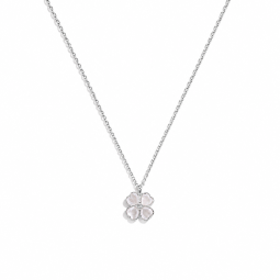
Silver-tone necklace with white four-leaf clover 33537003
Four white heart-shaped petals form a silver-tone edged clover on this fine stainless steel necklace, adjustable with an extension chain.
Price €3.84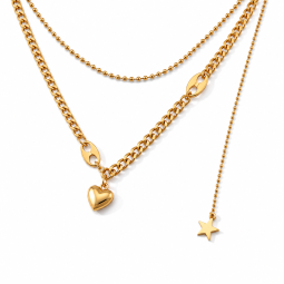

Gold-tone double-layer heart and star necklace 52305252
Two gold-tone chains, a smooth heart and a hanging star create this double-layer stainless steel necklace.
Price €5.28
Leave a comment